hi there!
i’m either a product designer who’s obsessed with content, or a content designer who can’t stop thinking about product. you decide.
looking for the latest? Recent.
hunting for old gems I refuse to let go of? Archive.

i’m either a product designer who’s obsessed with content, or a content designer who can’t stop thinking about product. you decide.
looking for the latest? Recent.
hunting for old gems I refuse to let go of? Archive.
menu controls redesign - content design
time to read (~4 minutes)
this story starts like every good design story. with a design system lead, a content designer, and a dream.
that dream being: creating a single control panel for meetings.
what kicked this off was our design system lead (Trip Carrol, he’s great) discussing current AX problems with the controls and their misalignment with the new global web library (which helps fix a lot of those issues).
which makes my brain go… “wait why are our menus the way they are?”
its like noticing the fishbowl for the first time
we just called this normal…
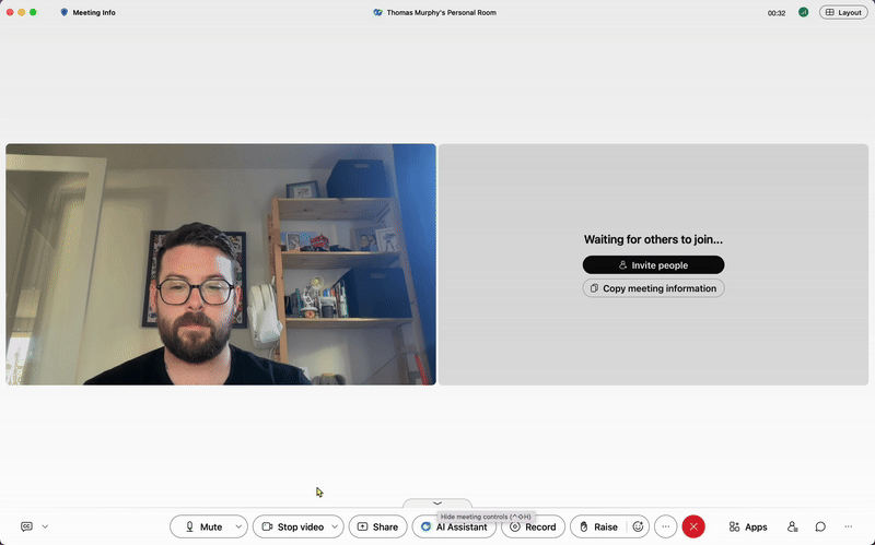
why are there three menus? why are some things repeated in multiple sections?

joking aside, this got me thinking. how might we fix this? can we fit everything in on menu?
so, after a little discussion and thinking, i came to 4 design constraints:
combine personal audio and video controls with meeting controls
make everything no more than two menus deep
improve the overall accessibility and hierarchy while we’re here
use the new component build for the global web library
then like most things, i started by questioning everything.
asking PM, asking design, asking engineering.
after getting a few answers, some sanity checks, and a couple “it has always been that way, idk.” i dived into mind mapping this myself.
I design in dark mode 😎 just fyi

and after a little of this with the team
i think i got to something pretty nice.
the one menu to rule them all 🙌
some major wins that came out of this after digging in
by moving everything to one menu, your audio (Mute) and video controls (Stop) can just be actions, making that choice binary
also by simplifying audio/video control that opens up the controls bar to be customizable and personal
by implementing toggles more logically we also relieve confusion with activating breakout sessions (which activated a dialog on toggle switch… like what?)
“This feels better... I was always frustrated by how many menus there were. I get confused with the audio and video settings all the time!”
but with all this came a hard lesson, especially with internal driven improvements.
the real fight actually wasn’t fixing the menus.
the real fight is getting others to see big problems that can be hiding in plain sight and prioritize them outside of their roadmaps and customer requests.
so the fight is ongoing 💪

